Friday 7 February 2014

The best way I found to make a quick & perfect "soffritto"

For years I've been struggling with cutting onions in "soffritto" size when cooking. But then, one day, with no reason, I found the perfect solution for the problem and I stuck with it ever since.
So I thought it could come in handy to someone else too :)

Here are the steps:

  1. Cut an onion in half
  2. Cut off the top part and peel off the harder layers - do not cut off the hairy bottom part
  3. Make some radial cut into the onion paying attention not to cut all through the bottom part
  4. You'll get a bunch of onion wedges attached to the bottom
  5. Now hold the onion together and start slicing it
  6. A perfect soffritto will come out!
  7. *bonus tip* remember to put a spoon of water in the pan with the oil, to avoid burning the onions ;)
"Why is it on this blog?" "Is this even linked with design at all?" some of you may ask.
Well, it's a trick that removes lot of frustration (and tears) from the process & makes me save time. If this ain't about user experience I wouldn't know how to call it. :P

Do you have cooking tricks like this one you'd like to share? :)

Friday 24 January 2014

Design is a mission - a.k.a. We are all makers!

Yesterday at our monthly meeting of the Milan UX bookclub on "Change by Design" a good question was brought up by a non-designer:
"You (designers) talk about your mission of making the world a better place, yet I've never seen a designer doing something for himself, in order to improve *his* world. If that's your mission shouldn't it be normal?"
I couldn't but agree more. :)
Design is a mission and it should permeate every thing we as designers do (at least this is my point of view), especially in the world of makers we are in today and with all the extra power we've been given.

So I started thinking of what I've done to improve *my* life and a few things came to my mind..


Travel
I like to travel.
Better, I LOVE to travel.

If I had enough money I'd travel most of the time. It teaches you so much, it broadens your view, it makes you understand that there are points of you you never thought of, it humbles you, it gives a new perspective to things...

Yet, being the kind of person I am, I need to remove from the trip as much stress as I can before leaving. I need to plan, to find out the best spots to visit and I need to provide myself with the right tools for the trip. And when they do not exist, I build them. :)

This is what happened when I planned to go to the Lofoten Islands on a solo trip a few years ago.
Being on you own in a place completely new where public transport does not run as frequently as you're used to, you need really clear tools to help you move around.

Veolia (the company which owned the public transport there) provided this timetable:


This timetable was useless to any foreign traveler visiting Lofoten islands: it had no route maps, no visual clues, nothing except times and places most of the time unknown to visitors. It did not give a hint on where those buses were going. Were they heading south? Could I take two to get where I want? No guess.

That’s why I decided to make my own. It had to be the right size to be carried in my shoulder bag, moreover it had to be easy and straightforward to consult when on the road in Norway.


Here I had:
  • a visible list of all the available bus routes - every headline being also a bookmark for quick access;
  • a visual representation of each route and its stops (circles) on a map of the island - these maps are designed to overlap, so that by flipping through the guide, I could easily go through all the possible routes visually and know exactly which ones stop where I needed;
  • the Veolia timetable for each bus at the very bottom of the page: once I found out the right one, I would need to know the time it stopped by.
This timetable made my trip much better, and not only mine: it also been an invaluable tool for other travelers I met on my way.
Silke was one of them:


sugru
sugru is a self-setting rubber for fixing, modifying and improving your stuff, a sort of play-dough that becomes hard overnight and sticks to every surface. I bought it a year ago and it's my favorite tool for hacking things better.

One example overall: my mum needed a bigger container for the aerosol tool, so I cut a hole in a tupperware, used sugru rubber to make the top part stable and to avoid leaking and the trick was done!


And I could go on.. but let's sum things up: I truly believe in what Paul said, yet I think there's a difference in design-as-a-job and in design-as-a-mission and people are different. Some might choose the first, not knowing the latter is much more fun. :)

Yet in this world of makers everyone is a designer in his own way and you can discover design abilities in the most diverse people. For design is always about solving problems no matter how small or big they are and we are all makers at heart - ever since we started using LEGO blocks :)

***

Oh and for those of you who might be interested, here are *my* sketchnotes of the meeting:


Saturday 2 November 2013

UX Masterclass in Rome *my* summary

Last month I attended the UX Masterclass in Rome. Many useful information have been shared and suggestions on how to do our job better.
All in all a very nice conference, despite the "remote location" in Rome.

Beside being a pretty nice event on User Experience, this was also another great occasion to practice with my sketch notes.

So here's the visual summary of *my* UX Masterclass - meaning the sessions I attended that day:

"Life in the fast lane" by Ashley Benigno - Nokia

"UX Strategy" by Giuseppe Montella - Vodafone

"Visualizing the customer user experience using an experience journey map"
by Marcio Leibovitch - Yu Centrik

"Applying User Centered Design in large organizations" roundtable
with Luca Petroni, Robert Schumacher, Gavin Lew, Frederic Gaillard,
Thomas Visby Snitker, Helga Letowt-Vorbek


"Service Design and UX: Measuring and Improving the Overall User Experience"
by Robert Schumacher - Gfk User Centric

"Integrating UX in Product Strategy" by Simon Herd - Serco ExperienceLab
"Impactful Experiences starting with non-users" by Franco Papeschi - Web 
Foundation

"Ambient experience" by Job Rutgers - Ontario College of Art & Design
"The apple design project" by Antonio Rizzo - Università di Siena


"UX and ROI: the impact of UX on the business" by Frederic Gaillard - Axance

Unfortunately I had to run for the plane and couldn't be there to see all the "UX around the world in 60 minutes" talk. I regret it, because it was a lot of fun - every speaker bringing up funny facts about his country :D

So well done Assist!
See you next year? :)

Friday 29 March 2013

Tea bag usability

Every morning, the first thing I do when I enter the office is preparing myself a cup of tea. That's how I start the day, with a hot mug of tea (or infusion whatsoever).

Whenever I try out new stuff, here's my user journey:
I pick the tea I want to try full of curiosity & expectation
I unwrap the tea bag & throw the paper wrapper into the dust bin
I pour hot water in the cup
I put the tea bag in the cup
I recover the wrapper from the dust bin to know the right infusion time.

This happens *every single time* I pick a new tea flavour, for most of the process is done without thinking.
And as most of the things that happen *every single time* and cause trouble because of information, it's a design fault.

Here's the fault: the infusion time is printed on the wrapper.


Odds are no one considered the use case I'm in.
Having the infusion time printed on the piece of paper hanging from my cup instead of the wrapper wouldn't increase cost to the producer. Yet it would save me and countless others a hand in the dust bin.

Minor improvements can make a huge difference at times.
It's time to go back and check whether there's any use case you didn't consider in your last design. :)

Tuesday 5 March 2013

Gesture interfaces meet MYO

Natural interfaces are something that we've been talking about for a while now and in the last years ideas and products involving or enabling them blossomed and became intertwined with our daily lives.

Even though gesture interfaces had been in the field for around 3 decades, even 10 years ago it was hard for common people to think we would all have handheld devices gesture controlled in our pockets today. Yet we do. The iPhone was a great innovation that pushed technology to take a huge leap forward.

But iPhone was just the first step.
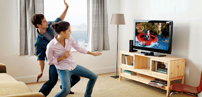
Wii first and then Kinect completely changed how games have been played.


Touch interface has been transferred to computers as well (just think of the Touch pad first or at the latest Microsoft Surface & Asus Pads) and Leap promises to transfer the gestural kind of experience to a computer screen as well.


Yet, somehow, technology has always been a strong enabler: we must touch a screen or have a camera looking at us & be in a specific space region in order to transform our actions into behaviour. Quite far from the "feels like magic" idea of great design, ain't it?

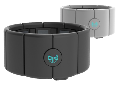
I believe the game is getting tougher now that a new competitor has shown up. MYO define itself as "The next generation of gesture control" and it's not hard to believe them!


MYO is nothing more than an armband (plus valuable APIs) which allows you to behave as a human controller to any device - once a set of movements has been linked to specific behaviours (and you know what does what - yes, this is not really "natural" as Norman says), you can just control the program/device by just moving your arm. In this case you wear the controller, which is much less constraining than ever.

Have a look at their video to understand its potential:


If this strikes an inner cord of yours, just go ahead and preorder one: you still have more than half a year to think of how to make use of it - the first products will ship in late 2013. What are you waiting for, then?